Monday, January 31, 2011

Balance


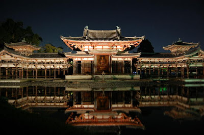
This is a picture of the Byodo-in temple in Kyoto, Japan. I love visiting historical places including these temples. The reason that temples that make me feel calm and Zen is maybe because a lot of them have symmetrical balance. It creates stability and a safe and solid visual element. I like this picture because like the Taj Mahal in India, water reflects the temple which creates radial symmetry as well. If I draw a line horizontally and vertically in the middle, the four pictures are still the same.


This is called "Spiral Building" College of Technology & Design in Nagoya, Japan.

This unique "imbalanced" design definitely draws my attention every time I walk by. Humans naturally seek stability and calm design especially in architecture. However, this is a opposite example of calm, it is chaotic and dynamic design.

I am pretty sure that it excites an art student's curiosity.


Monday, January 24, 2011

Emphasis


This is "Lipstick" by Bertram Bahner. I found this poster from the online store PopArtUK.

I picked this poster to show this week's "Emphasis". I liked this poster instantly, because it is lively and simply eye-catching. Even though the background photograph is monochrome, her skin and parts of the face stands out very beautifully. In addition to that, the pink colored lipstick bring into prominence as a focal point. The texture of tip of the lipstick is unique. How wavy and shiny it is, it makes it look like a 3Dimensional object. Without the pink wavy line, it creates large negative space on the right side and lose its compositional balance. There are three lines on her cheek and on the bottom add more colors to make this even more lively and leave fresh impression for the viewer.


Wednesday, January 19, 2011

Unity

This poster is from the website called "GURAFIKU". Shigeo Fukuda "Human Rights"
I think this poster is a good example of unity. There are several points that I can see "unity" in this poster. The men are walking to the same direction, (As you can see one man is simply divided in three in different colors). As a whole, there are invisible vertical lines between the man. I am not sure what it says in a tag but these are also lined vertical. The colorwise, very basic. Black background and red, white and blue. The picture stands out very well in a dark color. Now something clicked for me. Don't the colors represent the flag of France? So now I checked the meaning of the tag, and it is "human rights" in French. Duh!
I think this is successful poster to grab the viewers attention by using strategy of unity.

Monday, January 10, 2011

My first day!


I think everyone knows this picture, Van Gogh's Starry Night. He is my favorite artist of all time. His art work changed from his beginning years to his death. I like his art work at his late years with vivid lines.


This is from the movie "Little Miss Sunshine". Even just from the picture, you can kind of tell it is a comedy movie.

Throughout the movie, they use a lot of retro and pop colors like this poster. The color of furniture, actor's costume and this yellow van, etc. The visual effect is very important element of this movie. This picture make us think what they are doing, why they are running. It leads to some curiosity.

The poster with the running people is very simple but has an impact with pop yellow color on the back. The letters are simple, not anything pretty and gets larger to the end. In this case, seems like being simple gets more attention. This movie contains a lot of hidden jokes. Each family member have issues and they all fall apart but at the end of the movie, because of all the accidents and the problems they have, they all become one as a family. Therefore, the picture does not need anything else but them.