Wednesday, April 20, 2011
Project 3
Wednesday, April 13, 2011
Stock Images

I downloaded this image from iStockphoto. This was in the "This week's free files".
It is professionally done, very high resolution!
Wednesday, April 6, 2011
Constructing Meaning
 This is designed by Min Wang for Beijing Olympic 2008. He mentioned, "you can expect to see the game's iconography on just about everything in Olympic with such a massive global audience guaranteed, the job of communicating the event is no small task." (designboom.com 1-2par)
"This integrates charm of inscriptions on bones and bronze objects in ancient china with simplified embodiment of modern graphics." I like the strokes of seal characters as their basic form. Everybody in the world can be the "Target audience" for this case, and they can determine what game are symbolized for this designs . I think that these are a good example of "Stereotypes" and "Cliches" for typical sports icons but added impacts and changes with the designers cultural influences.
Wednesday, March 30, 2011
Critical Thinking
I picked up these old and new logos for this week. Logos could be very difficult to design because it should be simple, rememberable, original, meaningful and effective.  Burger King I like old one is pronounced "buns(burger)" better than new one, but the new one's diagonal line and blue circle gives fresh and young image to it. Over all, I still like the old one because it makes me think of eating a burger! Pizza Hut I like the letters in old one. Just like Burger King, new one has more movement but I like the stability on old one. TACO BELL AGAIN, I like the old one. The contrast of colors are awesome. The letters pop out and stabled, though this could be too retro, but I guess the new sign shows more "American friendly food" than traditional mexican food. KFC This one is humm, I think it is a tie. I like how it has original name by using cool fonts and appealing "Kentucky's original fried chicken", it is about food, but now it is more about "KFC"brand. The new one could be more rememberable. Score is 3(old) vs 0(new) and 1(tie)! What do you think?
 Burger King I like old one is pronounced "buns(burger)" better than new one, but the new one's diagonal line and blue circle gives fresh and young image to it. Over all, I still like the old one because it makes me think of eating a burger! Pizza Hut I like the letters in old one. Just like Burger King, new one has more movement but I like the stability on old one. TACO BELL AGAIN, I like the old one. The contrast of colors are awesome. The letters pop out and stabled, though this could be too retro, but I guess the new sign shows more "American friendly food" than traditional mexican food. KFC This one is humm, I think it is a tie. I like how it has original name by using cool fonts and appealing "Kentucky's original fried chicken", it is about food, but now it is more about "KFC"brand. The new one could be more rememberable. Score is 3(old) vs 0(new) and 1(tie)! What do you think?
Wednesday, March 16, 2011
Color

As you all know, one of Van Gogh's famous painting, "Cafe Terrace at Night". I have always loved his painting. It is kind of cool I have noticed that I look at the arts a little different way after I started taking this class. I look at the unity, balance, emphasis, color, etc many different element which I did not think about them before!
The yellow that push toward us, and the dark colored building and sky pull inward. The color of the road is bright that lead us inward and outward. Another small yellow square on the right side keeps good balance. This painting make me want to stop by this cafe and have a cup of cappuccino or something if I were in this picture. This yellow and orange color make me feel just warm and happy.
Saturday, March 12, 2011
About an Earthquake
I get many phone calls and emails from my friends and family in laws in the states about the earthquake and tsunami on the other day. And I appreciate it sooo much. My family got hit by earthquake but not like you see on TV. Luckily they had no damages. It really hurts me whenever I see what is happening over there especially northern area. I have friends in Tokyo who have not been able to go home yet and my friend's parents who live in the worst damaged area. I am worried about them. We have been trained for earthquake since we were very young, but there is nothing we (human)can do when something like this happen.
I am figuring out what I can do to help them.
Thank you very much for your concern.
I am figuring out what I can do to help them.
Thank you very much for your concern.

I just made this image. 愛 means LOVE.
Monday, March 7, 2011
Color
One of my favorite artist immediately come to my mind when I think about colors. Her name is Mika Ninagawa. She is not only a talented photographer but makes movies, advertisements, and works many for fashion. Two of these posters are for the movie "SAKURAN". With the one on the left, green and orange are used, making a good contrast and leaving a warm but bright impression. I like she looks like she has the attitude from her smile and a angle of her body. The letters layout vertically along her face which gives more Japanese traditional image. With on the top right, this image has symmetrical balance by dark colored temples (they are actually "red light district") on both side. Whole image has sort of cool impression with blue and pink but gold fishes put more impact in this image and also they make blue color sky look like water. 
These bottom two pictures are advertisement pieces. The one on the left advertises "BALI Island". The flowers on this side is more blur than far away. It creates the distance of depth, and vertical line creates of wider space as well. The contrast of these three colors are just beautiful. With the one on the right also has excellent color interaction and the black font image plays excellent in this piece.
Here is the link to her English website.
Wednesday, March 2, 2011
Problem Seeking Problem Solving
 I found this image from organizedwisdom.com.
This grabbed my attention immediately by many design strategies, such as unity (by color, and vertical, horizontal lines), emphasis (by color and font size), balance (by position and layout). I think this is successful as a poster of "convergent thinking" conveying the message to anybody, young and old, instantly. I learned about the difference of a designer's convergent thinking(efficient) and artist's divergent thinking(inventive) from this weeks assignment.
The designer for this poster must have had clear definition of the problem and had focused on the final result.
Wednesday, February 23, 2011
Cultivating Creativity

I have a tendency to like old stuff, antique, or even ruins.
This is a car my father used to drive 35 years ago. "Nissan Cherry" I think the design of cars around the 1950's to the 1970's are awesome. Maybe they are not functional as modern cars, but the more you use it, the more its character will come out.
"Creative people value existing knowledge." we love changes but the lessons from old ideas are enormous.
"Creative people value existing knowledge." we love changes but the lessons from old ideas are enormous.

A pencil drawing from my drawing1 class today.
Wednesday, February 16, 2011
Texture/ Value/ Illusion of Space
 I happened to find this beautiful picture from TheHindiMusic.com. and this was created by Jyothi Krishna.
Looking at this picture I almost feel like it pulls me into this flower field. There are many visual effects are used such as contrast, value, volume, space, and lighting to create a illusion of space. This little girl, the flowers and a couple of the flower cans in the front are in a bright spot. They look very crisp and clear and they pop out to the front. On the other hand, the background is dark, blurry with cloudy sky, which creates the far distance to the back.
I also like the color theme (purple, white and silver) and the composition of upper half and bottom half are very well balanced.
Wednesday, February 9, 2011
Rhythm / Lines

I found this image from lirtta.com, and this is done by visual and sound artist Jonna Karanka. I looked through her art work and I really like them all.
There are a repetition of lines, dots and patterns that create a visual rhythm. With the image on the left, multiple dots on the three corner draws the viewer's eyes to the woman's face. There are more patterns along her face fills up the bottom right corner. The rest of the space in the middle is drawn curved lines to express woman's words or could be her breath. The woman's arms are making diamond shape which creates a dynamic visual effect.
With the picture on the right, the thick curvy lines on the upper half definitely emphasizes the image in the middle. Again, various shapes and repetition of multiple patterns on the women's hair create the fun movement and energy. The edge of the right bottom corner fills the negative space and the large letters on the bottom left keep a nice balance.
Even though these both images have just one color, I feel so much energy from the lines and rhythm of the images.
Monday, January 31, 2011
Balance
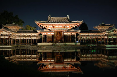
This is a picture of the Byodo-in temple in Kyoto, Japan. I love visiting historical places including these temples. The reason that temples that make me feel calm and Zen is maybe because a lot of them have symmetrical balance. It creates stability and a safe and solid visual element. I like this picture because like the Taj Mahal in India, water reflects the temple which creates radial symmetry as well. If I draw a line horizontally and vertically in the middle, the four pictures are still the same.

This is called "Spiral Building" College of Technology & Design in Nagoya, Japan.
This unique "imbalanced" design definitely draws my attention every time I walk by. Humans naturally seek stability and calm design especially in architecture. However, this is a opposite example of calm, it is chaotic and dynamic design.
I am pretty sure that it excites an art student's curiosity.
Monday, January 24, 2011
Emphasis

This is "Lipstick" by Bertram Bahner. I found this poster from the online store PopArtUK.
I picked this poster to show this week's "Emphasis". I liked this poster instantly, because it is lively and simply eye-catching. Even though the background photograph is monochrome, her skin and parts of the face stands out very beautifully. In addition to that, the pink colored lipstick bring into prominence as a focal point. The texture of tip of the lipstick is unique. How wavy and shiny it is, it makes it look like a 3Dimensional object. Without the pink wavy line, it creates large negative space on the right side and lose its compositional balance. There are three lines on her cheek and on the bottom add more colors to make this even more lively and leave fresh impression for the viewer.
Wednesday, January 19, 2011
Unity
 This poster is from the website called "GURAFIKU". Shigeo Fukuda "Human Rights"
I think this poster is a good example of unity. There are several points that I can see "unity" in this poster. The men are walking to the same direction, (As you can see one man is simply divided in three in different colors). As a whole, there are invisible vertical lines between the man. I am not sure what it says in a tag but these are also lined vertical. The colorwise, very basic. Black background and red, white and blue. The picture stands out very well in a dark color. Now something clicked for me. Don't the colors represent the flag of France? So now I checked the meaning of the tag, and it is "human rights" in French. Duh!
I think this is successful poster to grab the viewers attention by using strategy of unity.
Monday, January 10, 2011
My first day!

I think everyone knows this picture, Van Gogh's Starry Night. He is my favorite artist of all time. His art work changed from his beginning years to his death. I like his art work at his late years with vivid lines.

This is from the movie "Little Miss Sunshine". Even just from the picture, you can kind of tell it is a comedy movie.
Throughout the movie, they use a lot of retro and pop colors like this poster. The color of furniture, actor's costume and this yellow van, etc. The visual effect is very important element of this movie. This picture make us think what they are doing, why they are running. It leads to some curiosity.
The poster with the running people is very simple but has an impact with pop yellow color on the back. The letters are simple, not anything pretty and gets larger to the end. In this case, seems like being simple gets more attention. This movie contains a lot of hidden jokes. Each family member have issues and they all fall apart but at the end of the movie, because of all the accidents and the problems they have, they all become one as a family. Therefore, the picture does not need anything else but them.
Subscribe to:
Posts (Atom)